Enhance the visualization of your data on a dashboard (based on BPC Data) by using the Hichert’s Success Rules for data visualization
In this article I’ll show you how to build a dashboard based on the Hichert’s Success Rules for data-visualization. I’ll use the graphomate Add-On which implements these success rules for SAP Dashboard Design.
The dashboard is built on data from a SAP BPC System and use for the connectivity with the BPC backend-system the EPM-Connector which comes with the EPM Add-In for MS Office.
1 Business Scenario
The business wants to compare the ACTUAL and FORECAST data (KPIs: Revenue and Cost) for the top 10 companies of the group. Furthermore, it wants to make some simulation for forecasting of the Costs (Manufacturing, Material, General Expense, Wages and Salaries…etc.) according to the variation of the sale quantities and the unit price for a given product.
At the backend, there is a SAP Business Planning and Consolidation, version for SAP NetWeaver (BPC for NW) system and for the frontend a dashboard created with the SAP Dashboard Design tool (formerly called Xcelsius) is preferred. Using a flash-based dashboard provides a zero footprint solution for viewing critical data in real-time. The dashboard user would not need anything more than flash player to view the data. This type of data visualization is very attractive to high level decision makers in the enterprise.
2 Software Versions
The required software for this scenario are the following (Only to build the dashboard. The versions mentioned here are the one I used for this tutorial):
- SAP Dashboard Design SP06 Patch 01
- Graphomate Enterprise version 1.3-F4 (Add On for Dashboard Design from graphomate GmbH)
The following software are optional (only if you intend to use BPC as backend system and the EPM Connector for the connectivity):
- SAP BPC 10 EPM Add-In SP14 Patch 02
- EPM Connector of EPM Add-In, (add-On for Dashboard Design, located in the EPM Add-In installation folder)
- SAP BPC 10 ODBO Client
- Microsoft Visual C++ 2005 SP1 Redistributable Package(x86)
For simply running and viewing the dashboard, only Flash Player is required.
All software (except for the Microsoft Visual C++ component) can be downloaded from the SAP Service Marketplace. It is suggested to always apply the latest support package for each software component.
3 Steps to build your dashboard
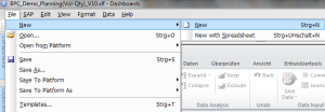
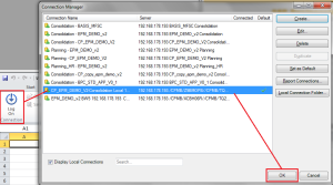
1- In SAP Dashboard Design, create a new dashboard and used a local connection to Log into the backend System (BPC server)
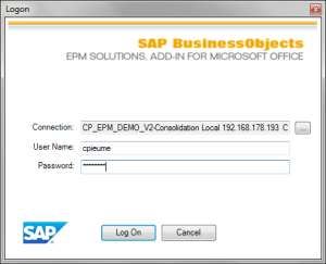
Enter your credential for the connection to the server and click Log On
2- Create a new BPC-Report in the Excel-sheet
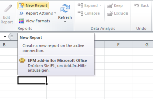
Click on “New Report” in the EPM tab of the excel workspace.
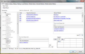
The “Report Editor” dialog will then be launched. Here you can configure the report output.
Drag and drop the ENTITY.PARENTH1 node from the cube dimensions box into the “Row” box.
Drag and drop the CATEGORY.PARENTH1 and the ACCOUNT.PARENTH1 nodes from the cube dimensions box into the “Column” box.
Drag and drop all remaining dimensions except TIME and PRODUCT from the cube dimensions into the Page Header box. Note: The dimensions TIME AND PRODUCT will be configured in the dashboard as dynamic filters.
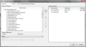
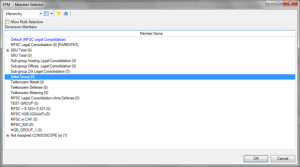
For each dimension in the row and column box, select the members by clicking the checkboxes, then clicking the “Right-Arrow” key to move the selections into the “Selected Members” box. Then click “Ok”.
Note: For the ENTITY dimension, you can just select the top 10 entities you want to show and eventually the parent node for the grouping/total.
For each dimension in the “Page Header” box, select one or many members to define the context of your report
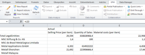
3- The report is then generated in the excel spreadsheet. The values are retrieved from the BPC system and statically stored in the excel sheet.
4- Before starting to build the layout of your dashboard, it is recommended to prepare your excel sheet in order to facilitate your subsequent actions.
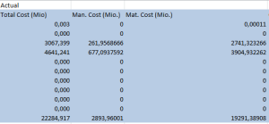
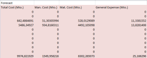
I recommend to first copy the data return by you report (actually those data you want to show on your dashboard i.e. the top 10 entities + the total) in a specific area on your sheet.
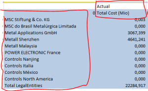
In the sheet, mark you different data area with different colors
Some Excel EPM-functions like the function EPMOlapMemberO() are not supported in Dashboard Design.
In order not to have the label value not showing on your dashboard, you have also copy the columns and rows where those functions are called to your dashboard data area.
Note: Further on, you can set a data connection to the BPC server to update the value for these fields (see my previous post on “How to use the EPM Connector to visualize BPC Data via Dashboard Design” in the “Extra Notes” section)
Lastly, it is important for better visualization to define an optimal “Scale” for your data in order to best use the available space for important information. You may have to convert you data in thousand (by dividing by 1000) or in Million (by dividing by 1000000) depending on how big or small your figures are.
5- Next, you will begin to build the layout of the dashboard starting with the first chart for the Revenue KPI.
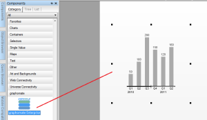
Drag and drop the components for your dashboard from the components section on the left into the layout editor.
Start with the graphomate Enterprise component to build the chart for the comparison of the Revenue KPI.
Configure your component as follow:
On the “General” Tab
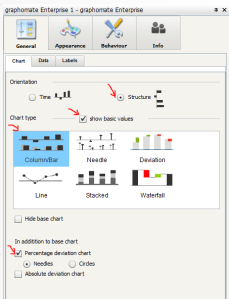
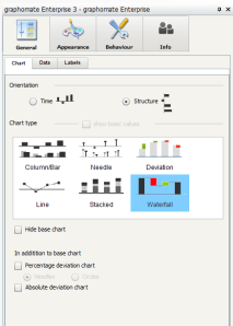
Under Chart, select the “Column/Bar” Chart type, then choose the structure orientation for the chart and check to show basic values (this is to allow to show both values ACTUAL and FORECAST on your chart). In addition to the base chart, check to see the percentage deviation chart and choose the “Needles” representation.
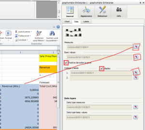
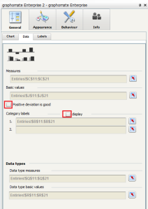
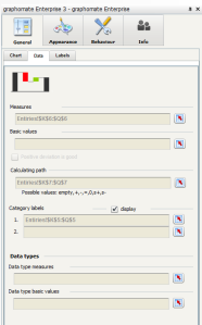
Under Data, click on the button next to the “Measures” input box and bind this to the cells where you want to hold your KPIs data from (i.e. actual Revenue). Then click the button next to “Basic values” input box and bind this to the cells from where you want to get your basic-KPIs for comparison (i.e. the forecast Revenue). The same way, bind the “Category labels” to the cells where you load you entities labels. Check to specify that in this case, positive deviation is good (for Revenue). Also check to display the category labels on your chart.
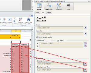
For the data type definition, you should have previously defined an area in your sheet for the data type for both KPIs (Actual and Forecast). Next bind the button next to the data type for each KPI to the corresponding cell range in the sheet.
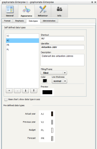
The data type is useful in formatting the data accordingly to the definition you made in the setting for each type of data (AJ=Actual Year, PR=Forecast, VJ=Previous Year, PL=Planning).
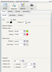
These settings are made under the tab “Appearance > Data types”.
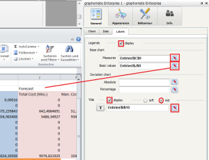
Under Label, click the button next to “Measures” and bind it to the cell from where you want to hold the label for the KPI (i.e. Actual). Do the same for the “Basic values”, this time bind it the label for the basic values (i.e. Forecast). Then bind the “Title” to the cell with the chart title (i.e. Revenue). Finally, check to display both the legends and the title.
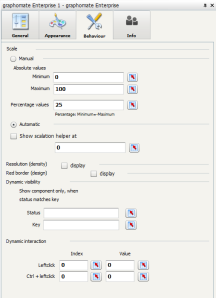
You can continue if you need with other settings for your chart i.e. “Appearance” and “Behaviour”
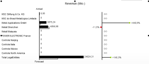
You end up with a chart similar to the one on the figure below:
6- Repeat the previous action to build the chart for the Cost KPI.
This time, choose not to display the Category labels, since the both chart (Revenue and Cost will use the same). Also, do not check “Positive deviation is good” in the case of cost the positive deviation is not good.
The end result is then similar the one shown below.
7- Next drop on the layout the controls for the simulation.
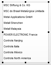
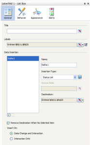
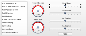
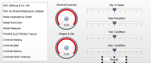
Start with the a List box to allow to user the select an entiy on which the simulation will be based.
Configure the list box accordingly
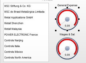
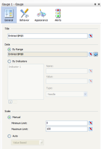
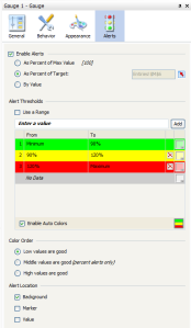
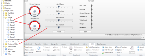
Next drop 2 Gauges on the layout; one for the General Expense and the other for the Wales and Salaries. Then configure the Gauges to reflect the values of the General Expense and the Wales and salaries that you defined on your sheet.
Now add 4 horizontal sliders to allow the variation of the parameters quantity of sales, Sale Price/Item, Material Cost/Item and Manufacturing cost/Item. Then configure them to behave accordingly.
Also add a “Reset” button to reset the simulation to the initial values.
8- Finally, add another chart to show the variation of the Cost KPIs when the parameters change in the simulation.
Drop another graphomate Emterprise component on the layout and configure it like on the picture below (This time, use a waterfall diagram instead):
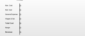
You end up with a Waterfall diagram showing how the different cost behave when the parameters (quantity of sales, sale price/item…etc.) change
9- You can also enhance the dashboard with controls to hold live data from the BPC server, to allow the user to select new filters and submit a new request for data and to write-back the simulation parameter into the database.
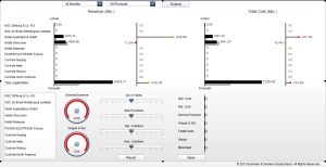
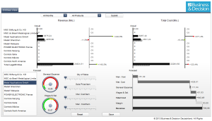
The complete figure looks as follow:
10- The model is now complete. You can test it out by clicking the “Preview” button.
Once the dashboard is loaded, you can select a specific product for the filter and click the “Submit” button. You will then hold form the BPC server the data related to this product. By selecting in the List Box an entity, you can make some simulation by changing the values of the different parameters. Afterward, you can save your change back in the BPC System.
How to Use the EPM Connector to Visualize BPC Data via Dashboard Design (aka Xcelsius)
This article explains the steps to visualize BPC data in a dashboard build using SAP Dashboard Design (formerly Xcelsius). It shows how to use the SAP BPC EPM-Add-In for Excel to build a report, and the SAP BPC EPM Connector to enhance the functionality of the dashboard.
The SAP BPC product version referred in this post is SAP BusinessObjects Planning and Consolidation 10.0, version for SAP NetWeaver.
1 Business Scenario
In this scenario, the business wants to view real-time data from their SAP Business Planning and Consolidation, version for SAP NetWeaver (BPC for NW) system via a dashboard created with the SAP Dashboard Design tool (formerly called Xcelsius). Using a flash-based dashboard provides a zero footprint solution for viewing critical data in real-time. The dashboard user would not need anything more than flash player to view the data. This type of data visualization is very attractive to high level decision makers in the enterprise.
2 Software Versions
The following software are required (only to build the dashboard. The versions mentioned here are the one I used for this tutorial.):
- SAP Dashboard Design SP06 Patch 01
- SAP BPC 10 EPM Add-In SP14 Patch 02
- EPM Connector of EPM Add-In, (add-On for Dashboard Design, located in the EPM Add-In installation folder)
- SAP BPC 10 ODBO Client
- Microsoft Visual C++ 2005 SP1 Redistributable Package(x86)
For simply running and viewing the dashboard, only Flash Player is required.
All software (except for the Microsoft Visual C++ component) can be downloaded from the SAP Service Marketplace. It is suggested to always apply the latest support package for each software component.
3 Steps to build you dashboard to visualize the BPC data
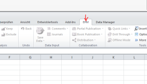
1- In SAP Dashboard Design, create a new dashboard and click on the EPM tab in the Excel-Workspace
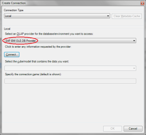
2- Create a local connection to the BPC-server
Use the SAP BW OLE DB Provider as OLAP provider
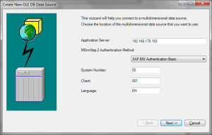
Enter the BPC-BW server name. Also, enter the BPC user and password. This is the same user and password that you would used to connect to BPC via the BPC Excel Client. Click “Next”.
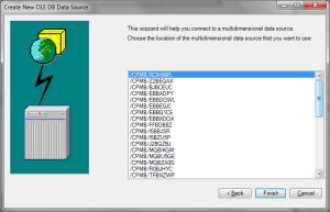
Select the Environment/Infoprovider and click “Finish”.
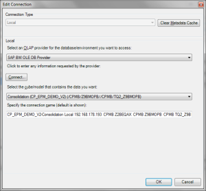
3- Log on to the BPC-server using the local connection you created
Select the newly created connection, and click “Ok”.
Enter your credential for the connection to the server and click Log On
4- Create a new BPC-Report in the Excel-sheet
Click on “New Report” in the EPM tab of the excel workspace.
The “Report Editor” dialog will then be launched. Here you can configure the report output.
Drag and drop the ENTITY.PARENTH1 node from the cube dimensions box into the “Row” box.
Drag and drop the CATEGORY.PARENTH1 and the ACCOUNT.PARENTH1 nodes from the cube dimensions box into the “Column” box.
Drag and drop all remaining dimensions except TIME and PRODUCT from the cube dimensions into the Page Header box.
Note: The dimensions TIME AND PRODUCT will be configured in the dashboard as dynamic filters.
For each dimension in the row and column box, select the members by clicking the checkboxes, then clicking the “Right-Arrow” key to move the selections into the “Selected Members” box. Then click “Ok”.
For each dimension in the “Page Header” box, select one or many members to define the context of your report
5- The report is then generated in the excel spreadsheet. The values are retrieved from the BPC system and statically stored in the excel sheet.
6- Before starting to build the layout of your dashboard, I recommend to prepare your excel sheet in order to facilitate your subsequent actions.
I’ll first recommend to copy a subset of the data returned by you report (actually those data you want to show on your dashboard – for example the Top 10 entities) in a specific area on your sheet.
In the sheet, mark your different data area with different colors
The Excel EPM-functions (for example: EPMOlapMemberO()) are not supported in Dashboard.
So, also copy the columns and rows where those functions are used to your dashboard data area (actually, you don’t copy the formula but the content).
Note: Further on, you can set a data connection to the BPC server to update the value for these fields (see that in a later section: extra notes)
7- Next, you will begin to build the layout of the dashboard.
Drag and drop the components for your dashboard from the components section on the left into the layout editor.
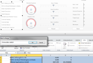
Map the components on the layout with the data on your sheet
8- When you are satisfied with the layout of your dashboard, in a next step, you will add a new connection using the EPM Connector.
This connection will allow you to retrieve data from BPC at runtime, instead of getting the values statically from the excel sheet.
9- In the appropriate cell, enter the command =GetReportDefinition() and hit enter.
This command retrieves the XML based definition of the BPC report and puts it in this cell. Later you will bind a property of the EPM connector to this cell.
10- Add a new connection to your dashboard
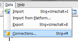
Call the data manager by clicking on “Data > Connections” in the main menu on by clicking on the manage connection button in the toolbar
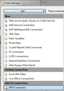
Then Add a new connection based using the EPM Connector
11- Define and configure the connection
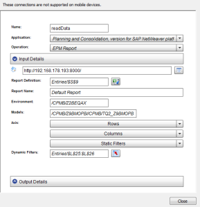
Give a meaningful name for this connection.
Next choose the EPM Application which you want to connect to. In this case, select “Planning and Consolidation, version for SAP NetWeaver platform”.
For the “Operation” field, select “EPM Report”.
In the “Input Details” section:
Next, enter the host name of the BPC web server. Enter both the host name and port.
Click the button next to “Report Definition” and bind it to the cell where the BPC Report definition resides then click “OK”. The other information like Report Name, Environment, Models and also the “Result” field in the “Output Details” section should be filled automatically from the report definition.
The finished connection configuration should now look like this. Notice that the cell range for the output has automatically been configured based on the EPM report definition. Click “Close”.
12- The model is now complete. You can test it out by clicking the “Preview” button.
4 Extra Notes
1-
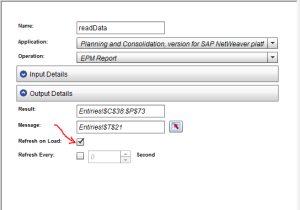
You can configure your connection to refresh on load. This could be necessary if you do not like to have the dashboard loaded initially with the static data used for the dashboard creation (which data could have been updated and would then not reflect the real data in BPC).
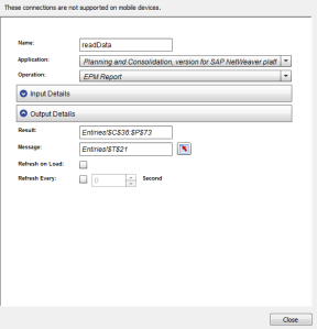
For that, just check the “Refresh on Load” checkbox in the “Output Details” section of the EPM Connection configuration
2-
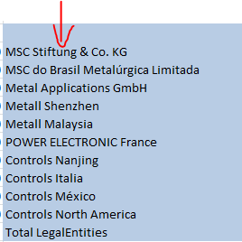
By copying the Label data in the report data area to avoid the unsupported EPM-Excel functions in Dashboard Design, you make this area of data static for the dashboard, i.e.: if these data change (member name modified or deleted) in the BPC-System, these changes will not be reflected on the dashboard, which could conduct to inconsistency.
To avoid that, you can create a new EPM Connection to retrieve the dimension member and replace the default one. This connection should then be refreshed the same time as the previous “dataRead” connection.
To define the connection:
First set the connection name and choose the EPM Application which you want to connect to. In this case, select “Planning and Consolidation, version for SAP NetWeaver platform”.
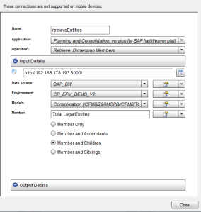
For the “Operation” field, select “Retrieve Dimension Members”.
In the “Input Details” section:
Next, enter the host name of the BPC web server. Enter both the host name and port.
Click the dropdown box next to “Data Source” and select “Retrieve”, the data source will then be retrieved according to the hostname and port you entered previously.
Repeat this action for the other fields (Environment, Models, and Member) and choose when necessary the right value between the one shown by the retrieve operation.
You end up with a configuration similar to the one shown below.
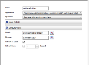
In the “Output Details” section
Click on the button next to “Result” and bind this to the cells where you want dimension members to be loaded on your sheet.
You can also select a cell where to put an eventual error message for the connection by clicking on the button next to “Message” and binding this to a cell on the sheet.
You can choose the Connection to be refreshed on load (this is a good idea if you want to have the dashboard loaded with the real/right data, but this will make the dashboard to wait for the data load before showing, which could be annoying if you do not have a high-performance connection to the BPC Server).





You must be logged in to post a comment.